Acme Inc brand expression refresh
MY ROLES: Brand expression • Ideation • Art direction
The visual refresh of this startup brand (actual name replaced with Acme Inc.) addressed several challenges. Acme Inc. was trying to move up-market to more enterprise customers, requiring a more sophisticated brand. There were also many issues with the existing brand, including an outdated colour palette that didn’t play well with the main brand colour (orange) and a limited set of brand assets, making it very restrictive.
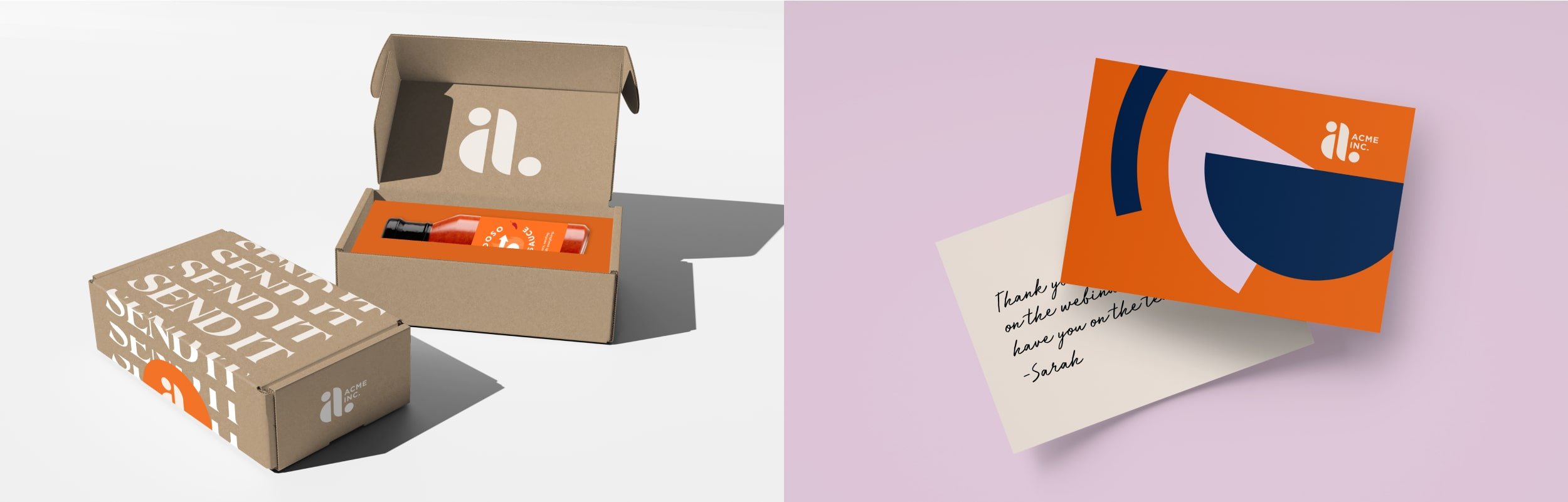
This visual refresh had to be accomplished in just a few months, so we kept three core elements from the original brand: the brand mark, orange as the main colour, and the circle as the core brand element.


The colour palette is bold and vibrant. Orange and off-white are the primary colours, but there is still a heavy use of secondary colours to complement and set off the orange. Unexpected colour combinations are used to create fresh, exciting, and modern compositions.


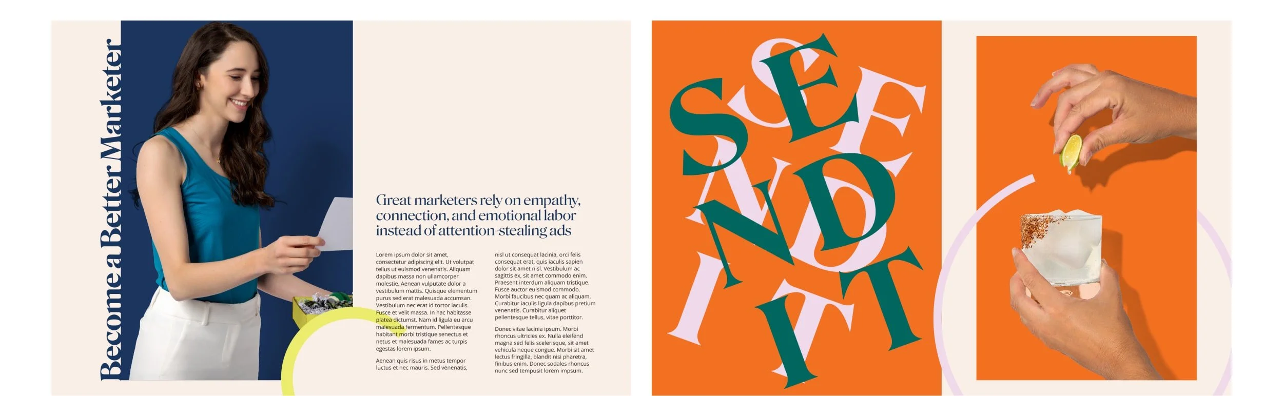
The visual expression strikes a balance between simplicity and boldness. The foundation is classic and geometric, but utilises various elements to create compositions that are unique, modern, and unexpected. The central focus is the circle and shapes derived from it—primarily half and quarter circles.

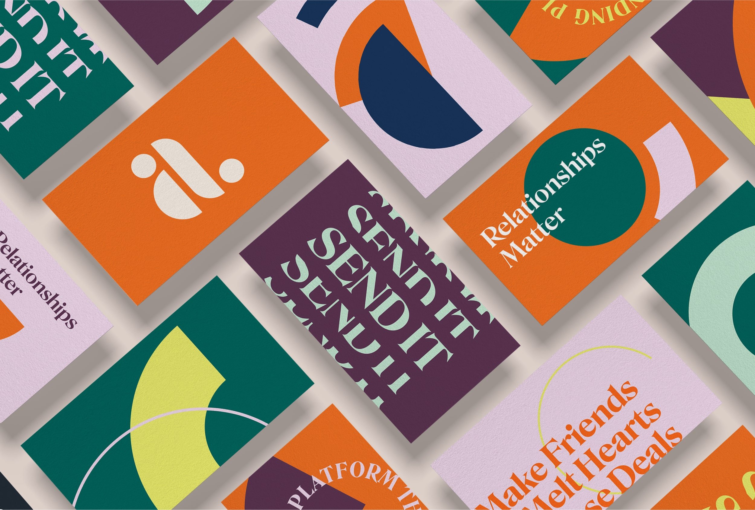
This visual brand is extremely versatile—it can be simplified to speak to a more refined audience, or elements and colours can be combined to create more exciting, dynamic layouts. In this way it is able to walk the fine line between sophistication and fun.